If you have been following this blog at all, you know that I have switched exclusively to a 3-colour system. The simplicity of this system allows me to concentrate on spontaneously mixing, and "composing" with colour, rather than hunting amongst 12-15 tube colours and continuously cleaning my brush to ensure colour purity.
My
standard three primaries have been Manganese Blue (Hue), Winsor Lemon, and Permanent Rose. This is still the most flexible combination for me, but it only truly works with Winsor & Newton professional-quality colours. Blue is the backbone of my palent. I love all colours, but I have got to have a blue that rings out like a bell, clear and pure as cold fresh air.
Sometimes, though, I need darker darks and harder greys. My standard 3 as above are all a little tonally weak, and thus limits how dark I can mix those darks that I am at last coming to terms with. Even being able to deal visually with heavy darks is something of a major achievement for me. If you saw my work from the mid-'90's, you'd understand what I mean. My eye has preferred (until now) very bright and pale colours. Like
Gwen John and
Jacques Villon in their late work, I was trying to achieve harmony through tone. Now, it is tonal contrasts which interest me more.
 "Pine Bog, Wickaninnish Beach" 18 X 24
" So this is my most recent painting with my standard 3 colours. Pretty tonally homogeneous, with blues-riff colours. Bit busy, but quirky compositional stuff going on, and some nice chewy bits, too. I glazed the sky with Mang. Blue and then overpainted the clouds.
 "Dark Shore, Tonquin Beach" 14 X18"
 Painted the rocks in one go, but had to beat the sky to death. What is with my inability to wipe on a good sky in one shot these days?? Painting the sand in wet-into-wet gave it the perfect effect. If you've been there in Tofino after the tide goes out, you'll know what I mean. Must be seen close up. (Eeeek! I am turning into a realist! ;)
This is my newest painting, but using what will now be my "Dark Standard" of Winsor Blue (Green Shade), Winsor Yellow, and Permanent Rose.
I do vary my yellow then as well and sometimes use Winsor Yellow with my "Bright Standard" instead of Winsor Lemon, so the only fixed colour is my red, the Permanent Rose.

The Winsor Blue (Green Shade) was a special order from
Winsor & Newton in the UK, and took about 6 months to get here. It is a much stronger tinter (uses more white for the same tonality) than Manganese Blue, being very similar to a true phthalo blue, sharing
the same pigment. It sure stains the brushes like a good phthalo!
But mixed with white, as above, you can see that it comes out very similar to Manganese Blue, at least in theory. In practice, however, it seems to lack a little of Manganese Blue's saturation when tinted. But it is very dark out of the tube, and so, when combined with the darker Winsor Yellow, makes for much darker greens, and of course when mixed with Permanent Rose, much darker browns and greys. I can mix something pretty close to black, in fact--at least to the untrained eye.

And, of course you know that I am a paint snob, using only the
Winsor & Newton top-of-the-line paint. Previously, I compared whites, and you can see from this demonstration as well the difference using the cheaper linseed oil vehicle makes on brilliance and and brightness. This is after these paints had only 3 months to dry on a sheet of paper. I don't care what any art company will tell you, yellowing oil will, somewhere down the line, take away from the brilliance of your colours, whether you mix them with white or use them straight. And if your white uses linseed oil as well, so much the worse for you. If you are a professional artist, you'll be worried by this, as I am--another reason for using
Winsor & Newton. You can also see from the above just how two of the more popular colour lines from Holbein and Gamblin stack up. I might be able to get away with the Holbein, but would not use Gamblin if I was paid to do it. Their Lemon Yellow is just as weak, proportionately, as their Mang. Blue.
I'll be comparing yellows in another post, but that is all the technical ranting I'll do for now.
I'll be working up more paintings like the above, from the blast to
Ucluelet and
Tofino Dad and I did in December. Real West Coast stuff. I depend on these occasional field-trips to keep me going. Stay tuned!

 "Orange House, Fernwood" 10X12" Oil on Board. $195.00.
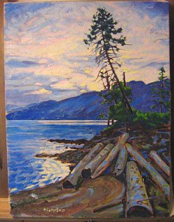
 "Beached Logs, Harrison Lake" 18X24" Oil on Canvas. $475.00.


